Friends of Lush
Referral link associated with a free Celebrate Bath Bomb offer.
Visit Friends of Lush
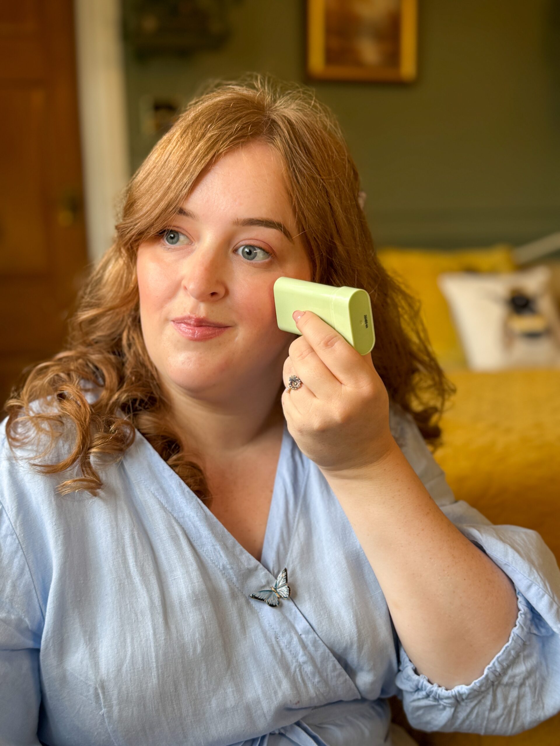
I love experimenting with beauty products, finding new colours and choosing makeup to complement an outfit. But as someone who is severely sight impaired, something as simple as identifying which lipstick I am holding can be unnecessarily difficult.
Familiarity helps. I usually know the products and colours in my collection, and I try to choose packaging with different shapes or textures so that items are easier to distinguish. However, this becomes harder when several products look and feel almost identical, with only a tiny label to tell them apart.
I have previously explored how disabled people really feel about the beauty industry, including the barriers people encounter when reading labels and using products. Accessible beauty packaging is something I want to keep talking about, because these details affect our everyday experiences of enjoying beauty.
So, today I wanted to share what helps me identify products, where I encounter difficulties and what I would like beauty brands to consider when designing their packaging.
The shade name is one of the most important pieces of information on a makeup product. Yet it is often printed so small that I cannot read it, even though it is essential for identifying what I am holding.
I have multiple Charlotte Tilbury and Tom Ford lipsticks, for example, and the labels can be difficult to read. In those situations, I may use an app or AI tool to help read the label.
These are products I own and enjoy, but identifying individual shades can become harder as my collection grows.
If I have one lipstick from a particular range, remembering which one it is might be straightforward. If I buy several, I then have several very similar cases to distinguish between.
Brand loyalty should not make it progressively harder to tell your own products apart.
I would like brands to give more thought to the size, contrast and placement of essential information. A clearly printed shade name, in a consistent position with strong contrast against its background, would be a useful starting point for customers who can access print.
That information also needs to remain accessible on the product itself, once the outer box has been removed.
Being able to read a shade name is useful, but I also want a clear description of what that shade actually looks like.
A creative name can be lovely, but it may tell me very little about the colour inside. A description such as “a deep burgundy with a matte finish” gives me much more information to work with.
I want to know whether a product is matte, glossy or shimmery, how sheer or opaque it is, and what kind of effect it is intended to give. Information about complementary shades could be helpful too.
I already use AI when exploring colours to buy. If I want a burgundy lipstick, I might ask for options that could suit my complexion and red hair before visiting a shop such as Boots. That gives me a starting point for looking at products. I use similar support when choosing combinations from the makeup I already have.

For another example of technology supporting a beauty routine, I shared what worked for me when I tried Estée Lauder’s makeup app for blind people.
I would love to see brands provide more of that descriptive information themselves, both on their packaging where possible and through accessible product pages.
Ingredients need to be easy to find and read too. People need accessible information about what they are putting on their skin, particularly if they have allergies or sensitivities.
For me, the priorities are the product’s identity, its colour and finish, and its ingredients, alongside clear instructions for using it.
Packaging has so much potential to communicate through touch.
Different shapes, textures and raised markings could help someone distinguish products without having to read a label or scan each item.

One idea I would like to see explored is giving shimmery lipsticks a textured outer case and matte lipsticks a smoother case. That could provide an initial clue about the finish before someone even opens the product.
This is a design idea that would need to be developed and tested with blind and partially sighted people. It would also need to be explained clearly and used consistently, so customers could learn what each texture means.
It would not identify every individual shade, but it could make one part of the process easier.
Braille is another option for customers who read it. I would like brands to consider how Braille, distinctive shapes and tactile markings could work together, giving people different ways to identify what they are using.
I find the different packaging colours and shapes used across the Drunk Elephant products I own helpful for telling them apart.
That is something that works for my own sight. Being severely sight impaired does not mean that colour has no role in how I identify things.
I would also find it helpful if more makeup packaging used colour on the outside to indicate the shade inside. A clear colour panel, for example, could offer another clue when distinguishing between products.
See more fashion, travel, beauty and accessible lifestyle content on Instagram.
Follow @fashioneyesta2012However, people have different levels of sight and colour perception. Colour needs to work alongside other identifying features, including touch and accessible information.
What helps me will not necessarily help someone with a different visual impairment, which is why offering several ways to identify a product matters.
A scannable QR code could lead to the product name, shade, finish, instructions and ingredients in an accessible format.
I would want that code to take me directly to information about the exact product and shade I am holding. Having to search through an entire range would add another task.
The destination matters too. I would want readable text that can be enlarged, clear headings and information that works with a screen reader.

There is also the question of finding the code in the first place. Brands need to consider how someone who cannot see it will know where to scan.
In my Victoria Land Beauty review, I explored raised QR codes and tactile symbols designed to help identify skincare products.
RNIB explains that NaviLens can recognise its codes without someone needing to know their exact position or focus directly on them. Information can then be presented visually, audibly and through vibration. That makes it a useful example for brands considering how customers will locate and access digital information.
One beauty example is Authentic Beauty Concept’s packaging initiative. The brand says it has introduced Braille product names and NaviLens codes on its upgraded Replenish range, Glow Mask and Hydrate Mask. It developed the changes with sight-loss organisations and input from visually impaired colleagues.
I would like to see more brands explore combinations like this. Having digital information available is useful, while tactile features can also help someone identify a product without reaching for their phone every time.
The best way to understand whether packaging works for blind people is to involve us in developing and testing it.
I would like brands to test everyday situations: identifying a product among several similar items, finding a particular shade, locating instructions and using the packaging after the outer box has been discarded.
Those details matter when a product becomes part of someone’s daily routine.
It is also important to recognise that accessibility covers different needs. Being able to identify a product, open it, hold it and apply it are all considerations.

Rare Beauty’s Made Accessible initiative is an example of a brand investigating product usability. It partnered with Casa Colina Research Institute to study selected products and identify features that help people with dexterity difficulties open, close, hold and apply them.
That work focuses on dexterity, while the priorities I have discussed here include identifying shades and accessing information with sight loss. Both deserve attention.
I would like to see brands involve people with a range of disabilities early in the design process, pay them for their expertise and use their feedback to make practical changes.
I explore this wider approach in my guide to universal design and what it means for disabled people, including how tactile packaging features can make products easier to distinguish.
Accessibility increasingly affects what I buy. I am interested in brands such as Rare Beauty and pay attention to how easy products are to use and what brands are doing for disabled people.
Those considerations now sit alongside the colour, finish and overall look I want.
I still want the pleasure of discovering a beautiful lipstick or experimenting with a new makeup combination. Being able to identify and use those products makes that experience more enjoyable.

For me, accessible beauty packaging means being able to pick up a product and find out what it is, which shade I have, what it contains and how to use it. It means brands thinking about what happens when someone takes their products home and uses them every day.
And it means remembering that the customer buying a fifth lipstick from their favourite range should still be able to tell it apart from the other four.
For the application side of my routine, I’ve also shared five makeup tips for visually impaired people, from blending products to applying eyeliner and lipstick.
If you are a beauty brand looking to improve your packaging, product descriptions or customer experience, you can find out more about my accessibility consultancy, which draws on my lived experience and work with brands.
Which beauty packaging features help you, and which make things harder? I would love to hear your experiences in the comments.

Fashioneyesta
Follow along for fashion, travel, beauty, accessibility and lifestyle updates.